I want to talk about a very small but very impactful technique I use when shipping out my games.
And how by doing so, I delight my customers before they even have a chance to open the game and play it AND put them in the right mindset in preparation for playing the game.
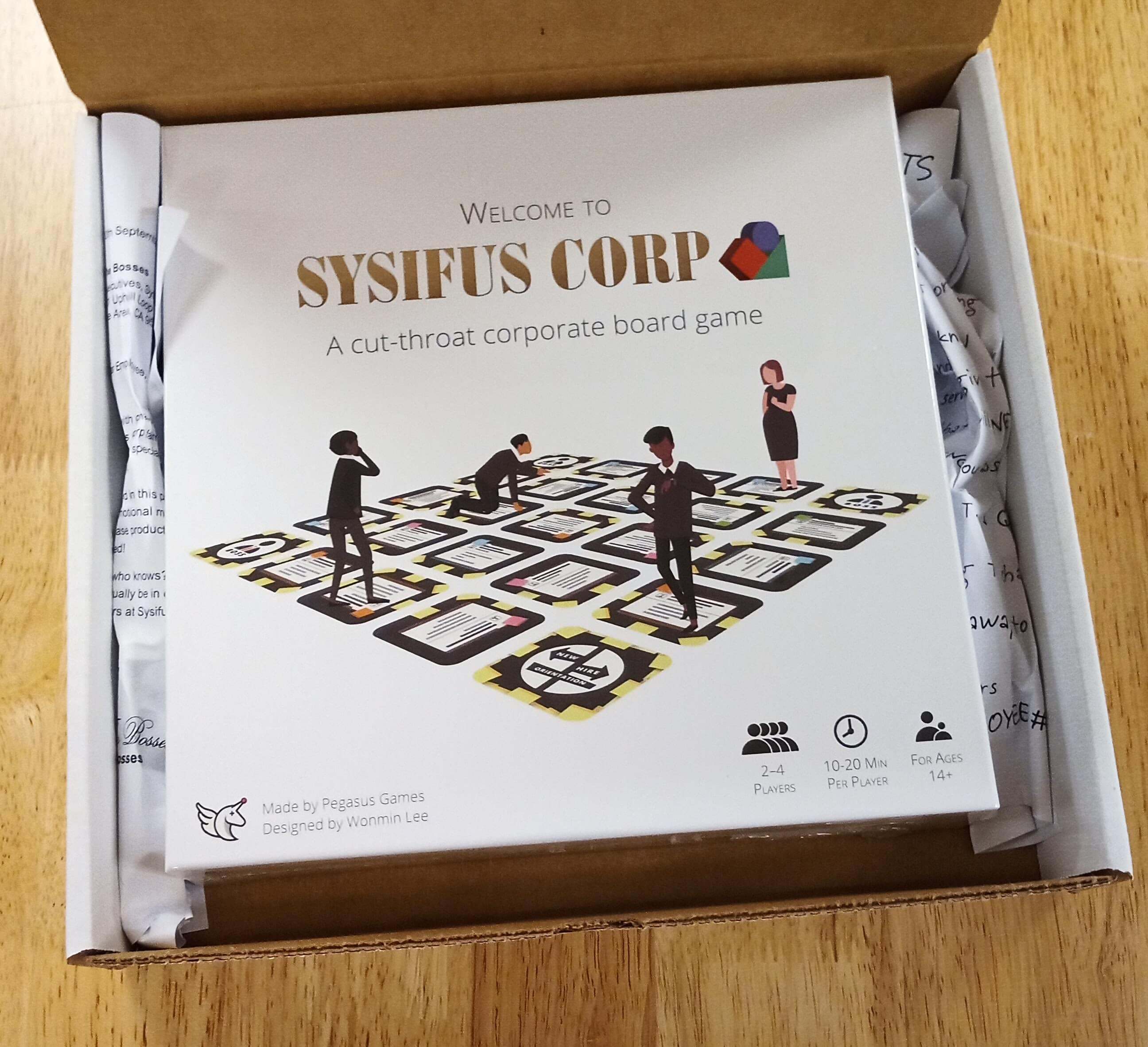
The box that my game comes shipped in.
But first, you need to know a little bit of background about my game.
I started working on this game three years ago with the goal of making something that was both strategically fun AND something that would convey the message I wanted to convey. Which was to hopefully inspire people out there to quit their mindless day jobs and to pursue their dreams.
Then, somewhere during the development process, my game’s theme of a “cut-throat corporation” emerged. It was the perfect theme for my game and was tightly interwoven into the gameplay mechanics. If you’re curious about how that works, you can sign up to receive a free print-and-play copy of the game or check out the rulebook.
So now that you know the background of the cut-throat theme, let’s take a look at the packaging of my game.
If you look at the picture below, you can see that there are two sheets of crumpled paper on both sides of the game box.
The shipping box opened.
This is so that the game box doesn’t move around inside the shipping box and get damaged during transit.
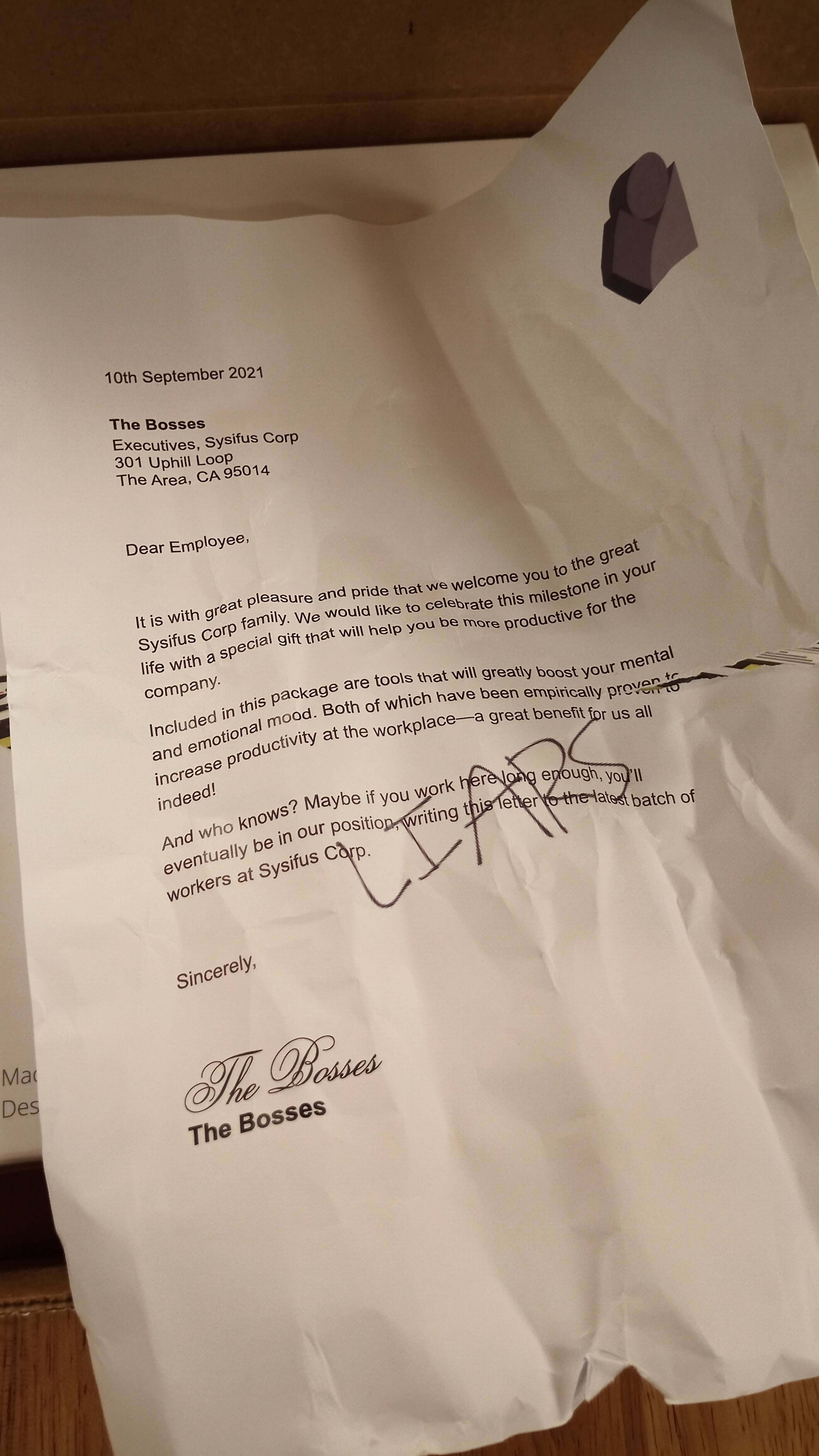
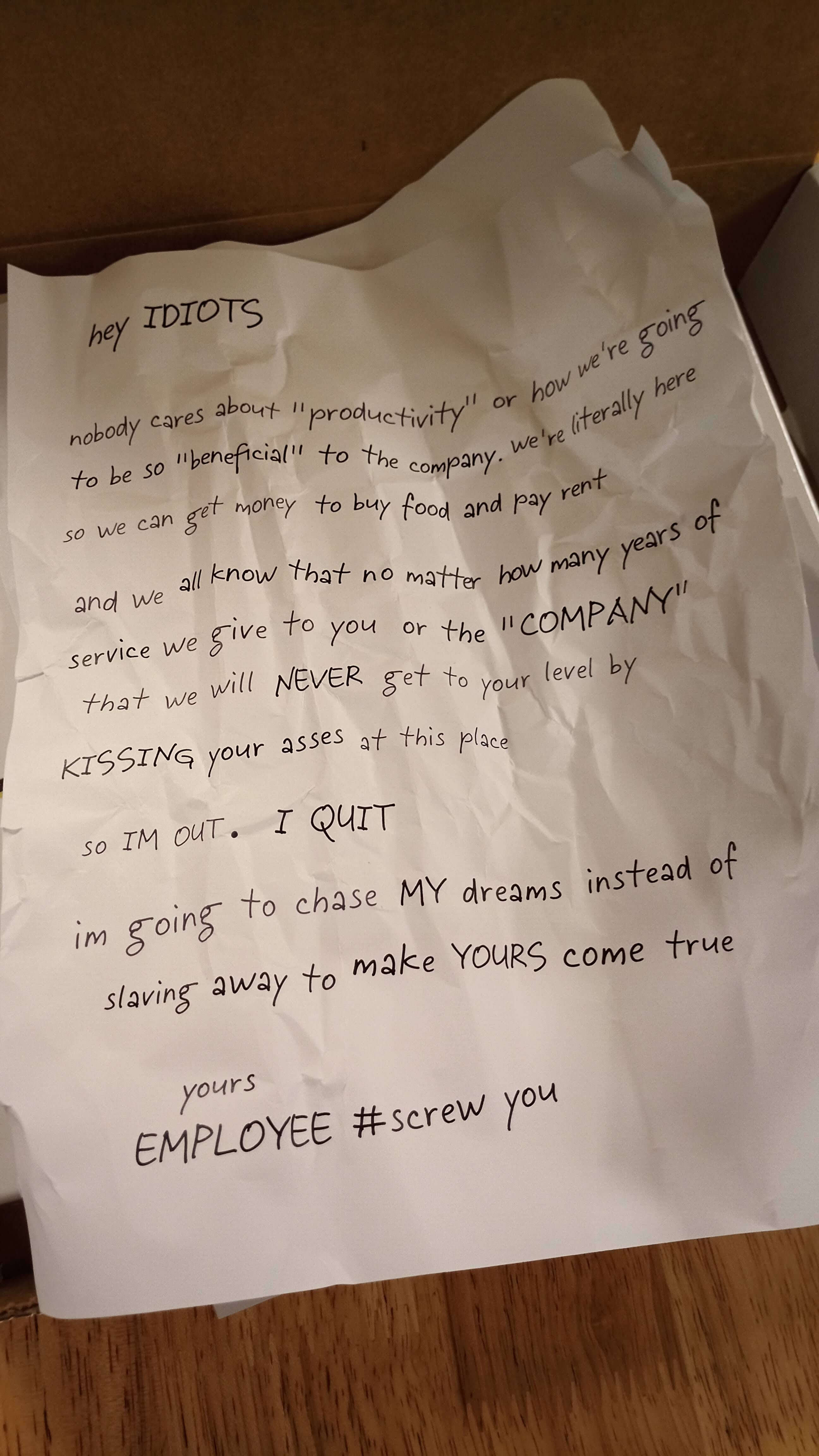
But there is also some text written on the papers. Take a look at what it says.
The crumpled up paper inside. Click to enlarge.
Now the customer is immediately pulled into the theme of my game without even having opened the box! And it seems to be universally well received.
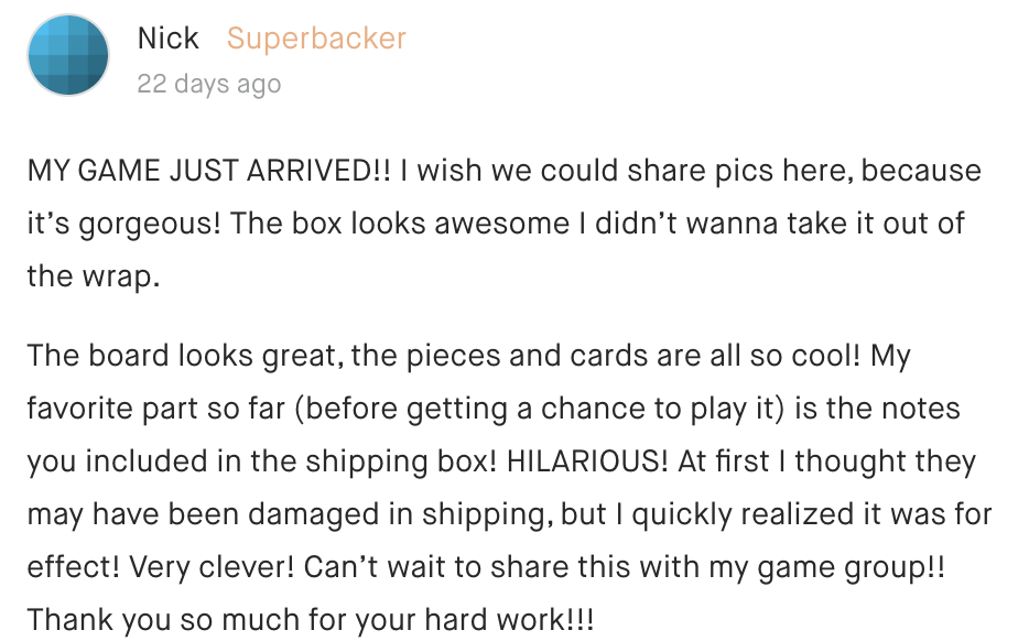
People seem to love the crumpled papers!
What about the actual game box?
Well if you take a look at the unboxing video below, I’ve also made sure when designing my box, that the unboxing experience is as sexy as possible.
It starts with the logo of the fake company, followed by more logos, and even more logos. I tried to emulate the Apple packaging design philosophy as much as possible.
I wanted my box layout to be as clean as possible and layered. So that each uncovered piece told another story as the user traveled through the experience of unboxing (corporate marketing BS translator: so that the pieces wouldn’t fall out when the box is turned upside down).
What do you think? What is the optimal layout of a board game box?






Comments