Here’s another post on how my board game changed over time. Specifically–how my Office Politics Cards changed.
Office Politics Cards are the bread and butter of the strategic gameplay for my game. You chain multiple cards together to create powerful effects that can change many aspects of the game board. Carefully strategizing which cards to use and managing your resources carefully is the key to winning.
These cards didn’t used to look like this though. Here’s how they came to look like what they do today.
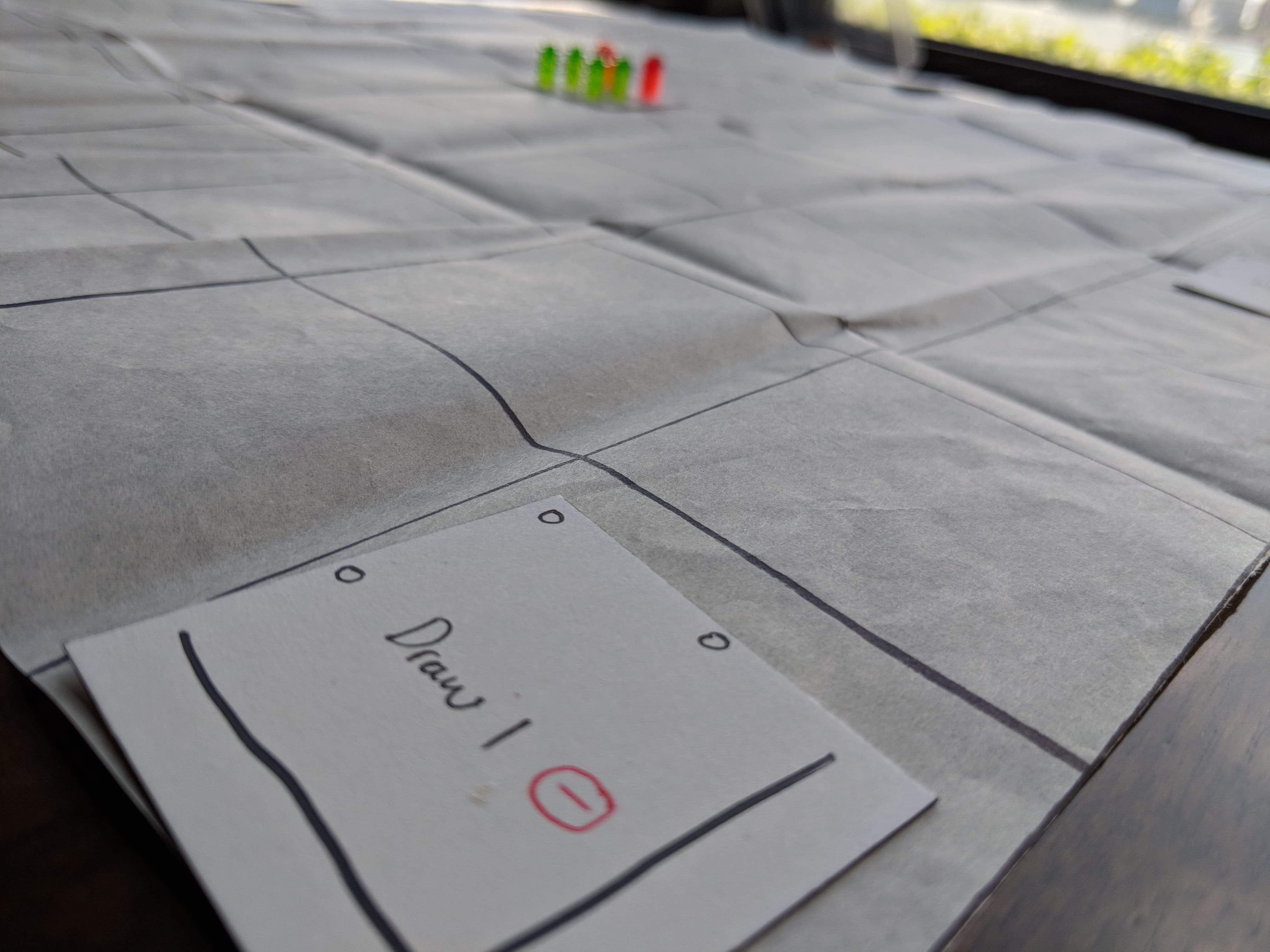
The very first iteration of my game using cut up index cards. This was a corner piece and the goal of the game was very different. You had to send your player pieces to these “action cards” to take advantage of the various effects written on them.
In this picture, for each player piece on this card, you were able to draw 1 red card.
An alpha version of what an Action Card looked like. The art was obviously a placeholder.
At this point, the game still had a dual karma resource system and various cards had various amounts of karma required to use the effects.
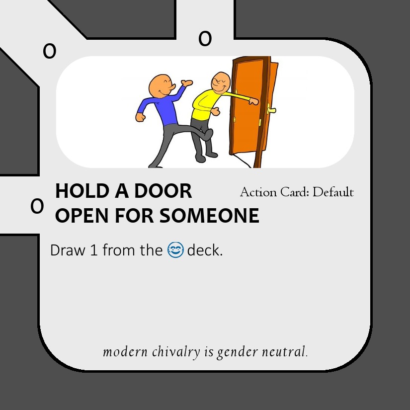
This was a basic good/blue Action card that let you draw one good karma card from the deck.
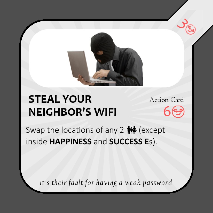
Negative karma Action cards were effects that actively harmed other players. Seen here is a card that let you swap locations with another player. Since it was an alpha design, I used a smirk emoji to represent “bad karma.”
However, I soon found that having Action cards be a part of the actual board meant that people didn’t really move away from the cards once they landed on something strong. So a lot of people were turtling themselves in random corners of the game board.
So I de-coupled the movement tiles with the Action tiles and created this. (Back to hand-written cards).
These new Action cards were publicly available to all as part of the “ability board.” Any player could use any ability on here and it would be taken down.
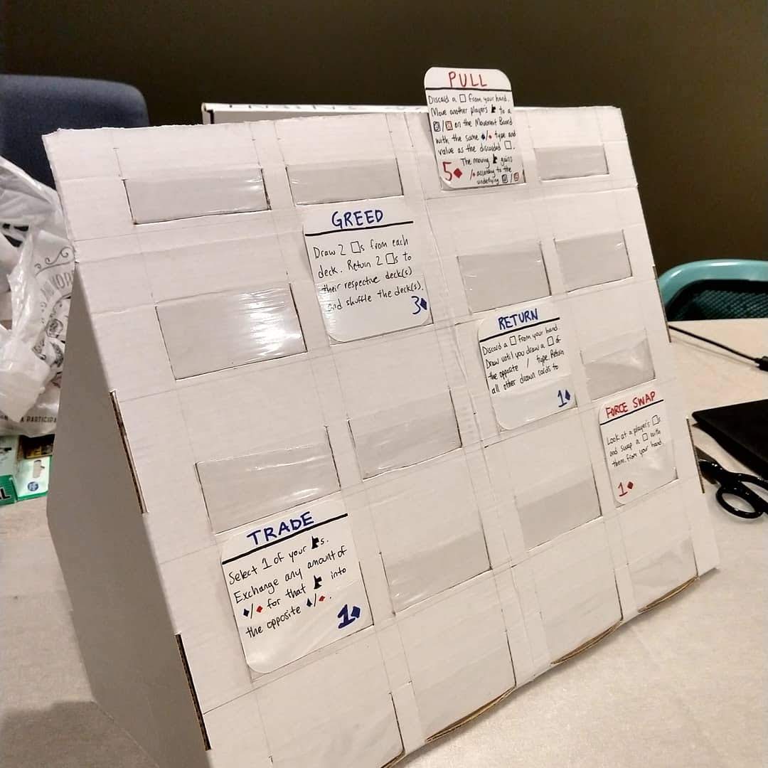
Here is an early prototype built using tape and cardboard.
A second prototype using a slightly better cardboard and a slightly better plastic wrap. The tighter plastic made it really hard to take these cards out once used.
Not to mention that it was really cumbersome for new players to lean over to read each card to see what they did. Many players didn’t even bother and just brute forced their way through the game without ever using a single ability.
A beta version of the Action cards (now called Ability cards). A nicer design, but the functionality was still a little awkward. At this point though, I felt like I had a winning design and a complete game. Oh how wrong I was.
A close up of the Ability card. I used emojis instead of icons to save on designer costs. Later versions would have the flavor text in a different location or just get rid of them all together.
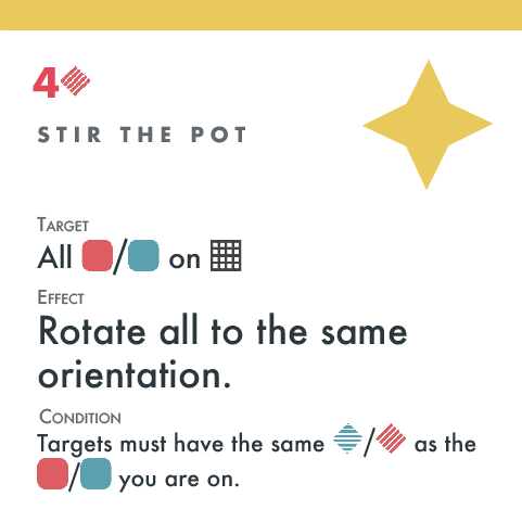
Another version of the Ability card. This time with clearly labeled descriptions to hopefully make it easier to understand the card at a glance. And using custom icons.
So turns out the idea was really bad. I hit a very low point of almost giving up. But I knew there was some fun in the game somewhere, I just needed to dig it up.
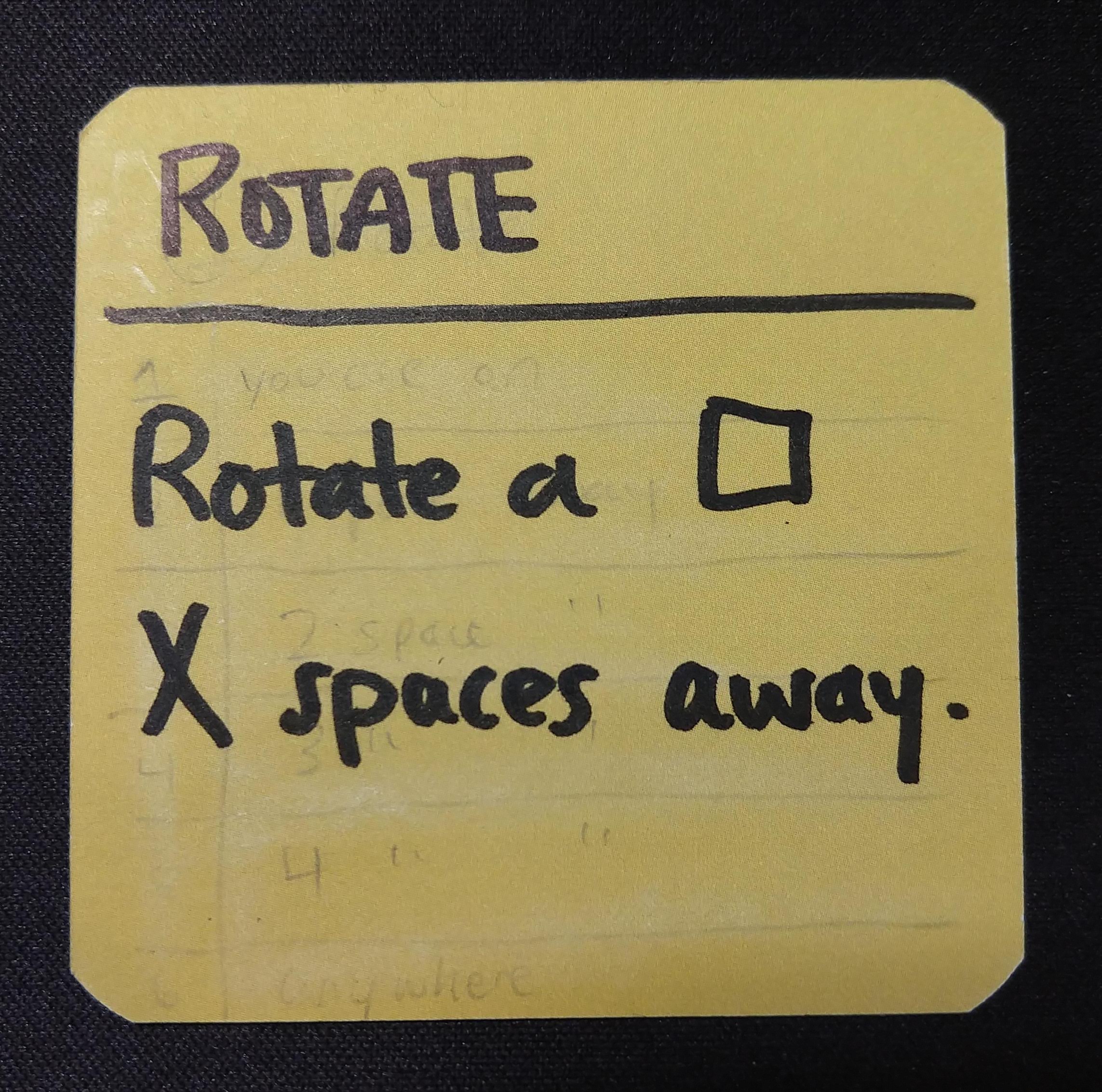
So back to handwritten cards. I was determined to reduce the amount of total cards down to a few powerful abilities. To do that, I made each ability cost a variable amount of resources.
So instead of having 2 cards that did the same thing but different values / costs, I just merged them into a single card.
Here’s a nicer design that shows what I mean. Originally this one card was three different cards. So players with low resources and a high cost card felt bad that they couldn’t use the card when they wanted to.
Now with variable costs, if players have this card, they can either choose to play it immediately, or to wait until they have enough resources to make the effect even stronger.
Coming up with names and effects for all of the different cards. Now they are called Office Politics Cards and have a corporate theme.
The focus now became how can you chain together as many cool effects as possible to get ahead of others.
For example, using a card to rotate the card you are on, then swapping locations with another player–thus moving yourself further while blocking in the other player.
The initial design of the Office Politics Card. No art because I couldn’t really afford a good designer / illustrator.
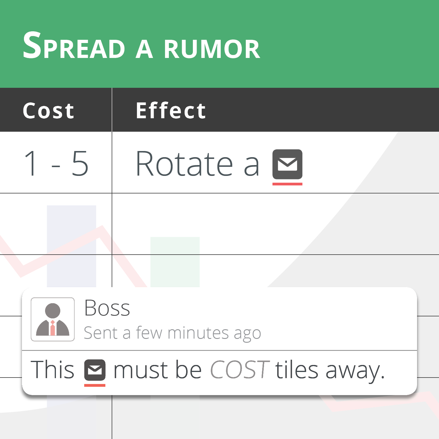
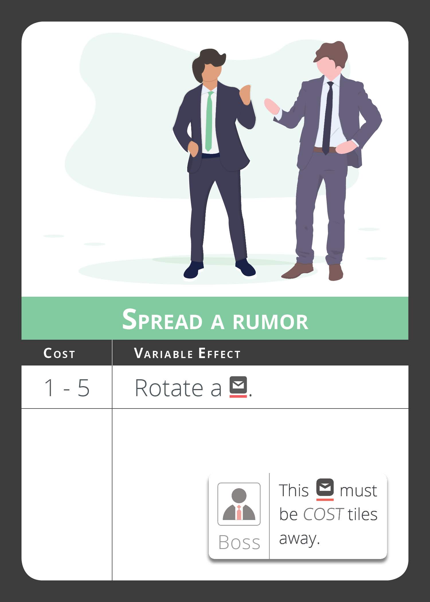
I modeled the card after Microsoft Excel / Google Sheets, with a small notification box on the bottom for any extra text / restrictions.
I found a great website for vector art (undraw.co/illustrations). I downloaded a bunch to see what the card would look like with art. It was looking much better! And it really helped to tell apart different cards at a glance rather than having to read the title.
The final design of the Office Politics card.
The base effect is written first, then any addon abilities are listed afterwards. These addon abilities are optional and can sometimes change the base effect drastically.
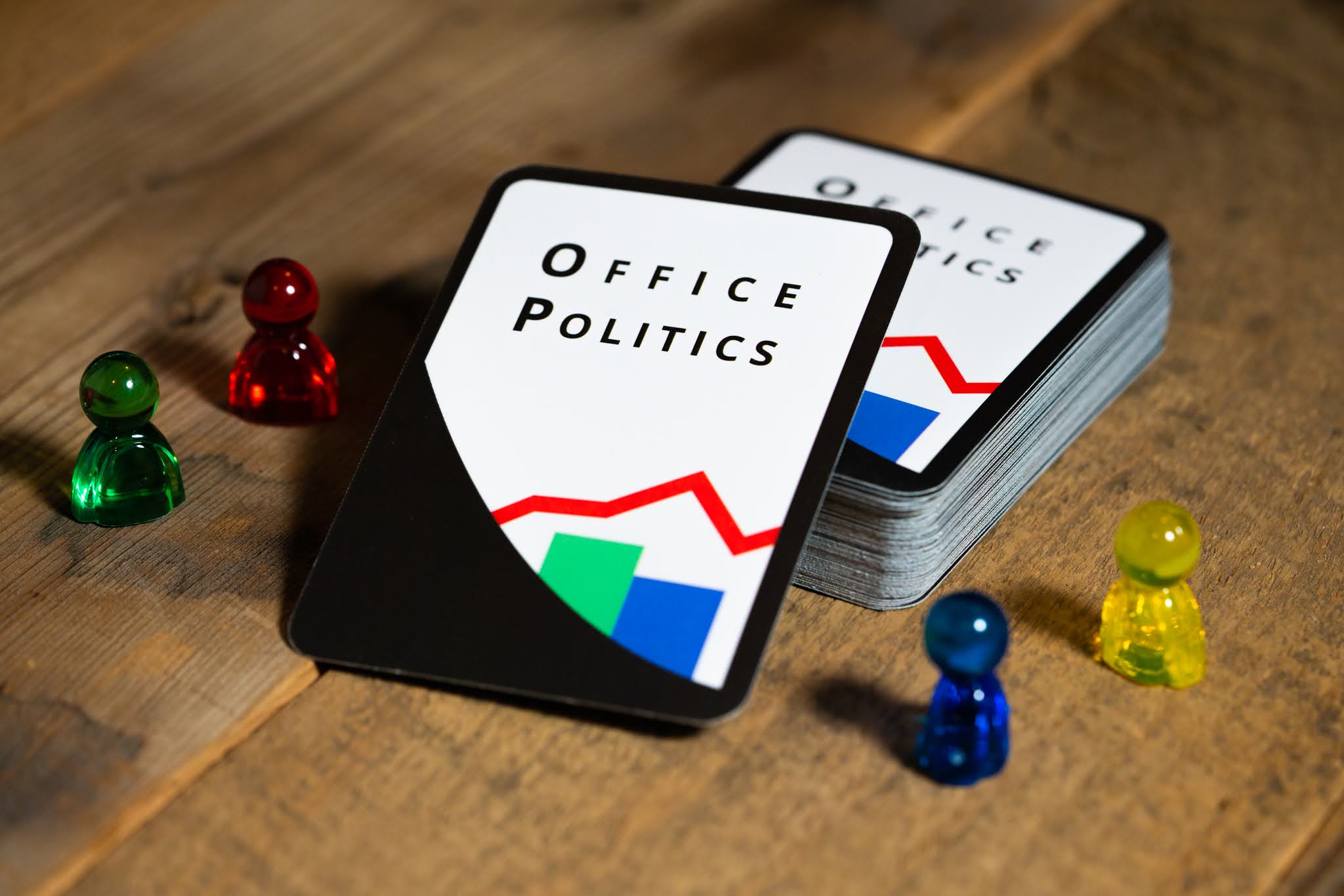
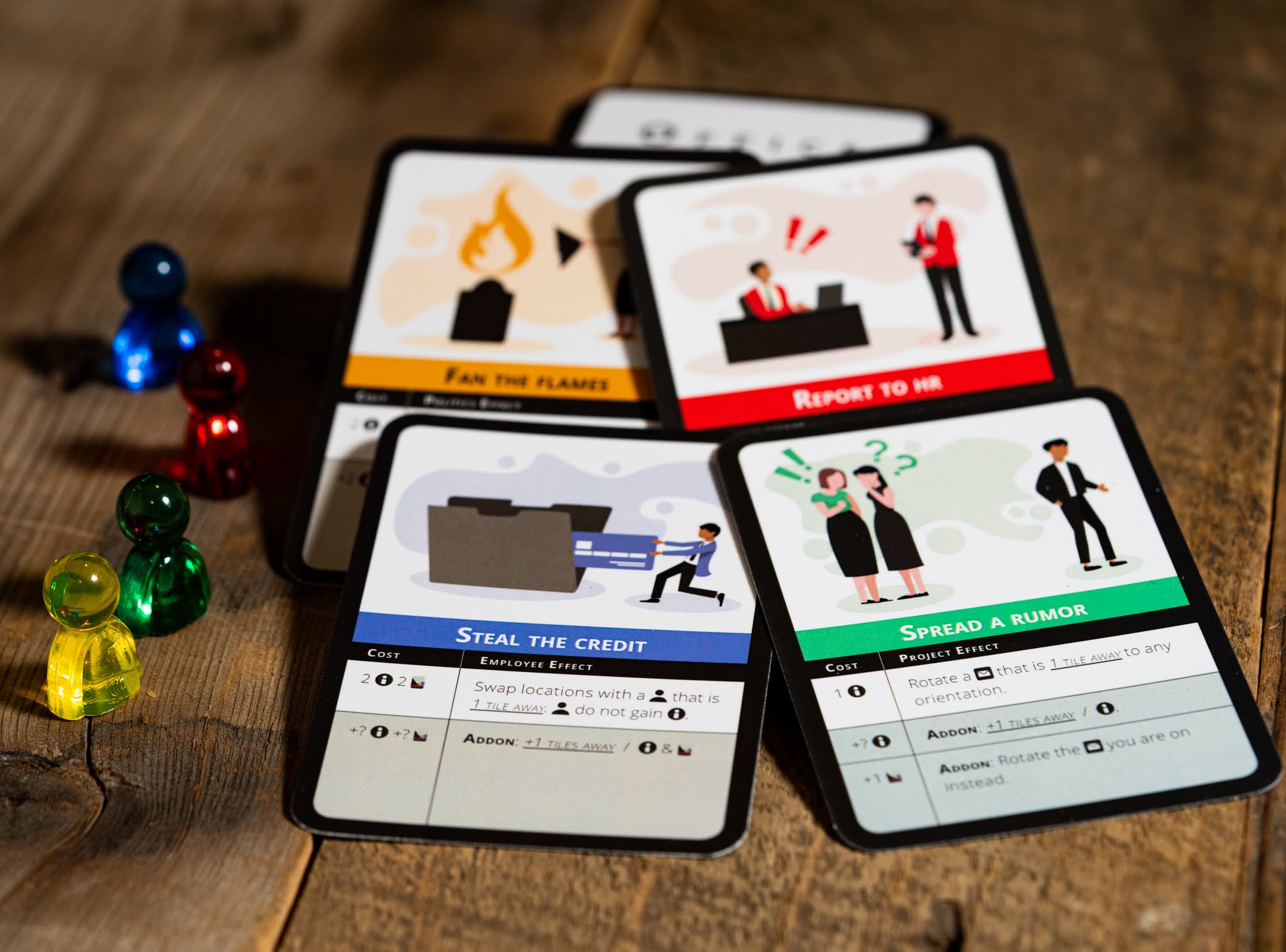
And a picture of the final cards!
These cards the are heart of the game and what makes the game very back-and-forth. Players are constantly stabbing each other in the backs and stepping over each other to be the first one promoted.
Sometimes towards the end of the game, it almost becomes like a puzzle game where players are trying to figure out the best possible / most efficient way to spend their turns using these cards.
If you’d like, please follow us on Kickstarter so you can be reminded when we launch.
Thanks for taking the time to read and please don’t hesitate to reach out with any questions or comments.








Comments